Designing a complex informational poster.
At Outside Open, we’re not just geeks. We also love design and a good challenge. Having listened to our support specialists struggle to spell out words over the phone, we took matters into our own hands and set out to create a phonetic alphabet poster that would not only be utilitarian, but could stand alone as a design piece in its own right.
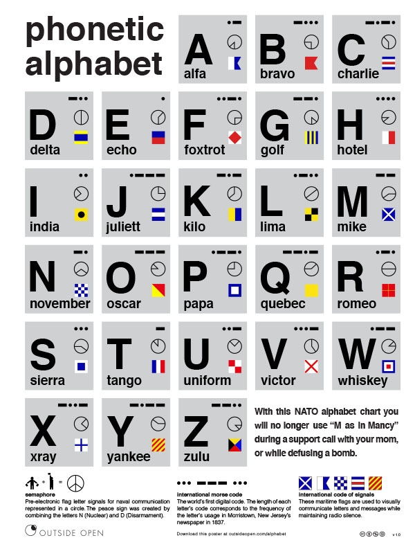
With these goals in mind, we began to brainstorm ideas. We settled on Helvetica as our typeface and a grid layout that emphasized symmetry for a clean, modern look. As bonuses to the phonetic alphabet, we wanted to add other “meta data” such as Semaphore flags, International Morse Code and Code of Signals as learning opportunities for geeks and non-geeks alike.
We set out to build all the poster assets ourselves to avoid licensing issues and for the added challenge. Meta data ideas that failed to make the cut included Elvish, Braille and Klingon. After the initial brainstorming, we drafted a set of guidelines and goals to help keep us on track. We wanted to build something that met the following constraints:
- Helvetica font.
- Flat design.
- Cleanly present as much info as possible.
- Phonetic items easily visible from 5 feet on the 8×10 prints. (curse you, November!)
- Practical and useful for many purposes. (on the phone a lot, learning morse, semaphores etc.)
- Nerdy and fun.
- Obscure cultural reference. (Archer is a favorite show here! (phrase coined by John Hodgman))
- Creative Commons licence.
- Distribute as cheaply as possible.
- A strong defense for each design decision and element.
An example of the last point above re: “Defense for each design decision” is illustrated by how the color scheme evolved dramatically over the entire process. It started with colors that were picked out of personal preference and went through multiple iterations of defense. Eventually we arrived at the current flat “aircraft grey” because there was no defense for the alternating checkerboard scheme, no meaning behind the blue / yellow etc. Because everything on the poster is informational, we could also not defend why the squares alternated in color / opacity. We settled on a single color – aircraft grey.
One of the fun facets of designing the poster to be informational was that during the research, we learned some really interesting facts about the different elements. From the formation of the peace sign by combining two semaphores to the fact that morse code “beep” complexity & length is dictated by the frequency of use of letters from a 1837 American english newspaper – the most frequently used letters are the easiest to form on the transmitter.
This has been a fun project as we hope you enjoy it too 🙂
Get your free copy here!